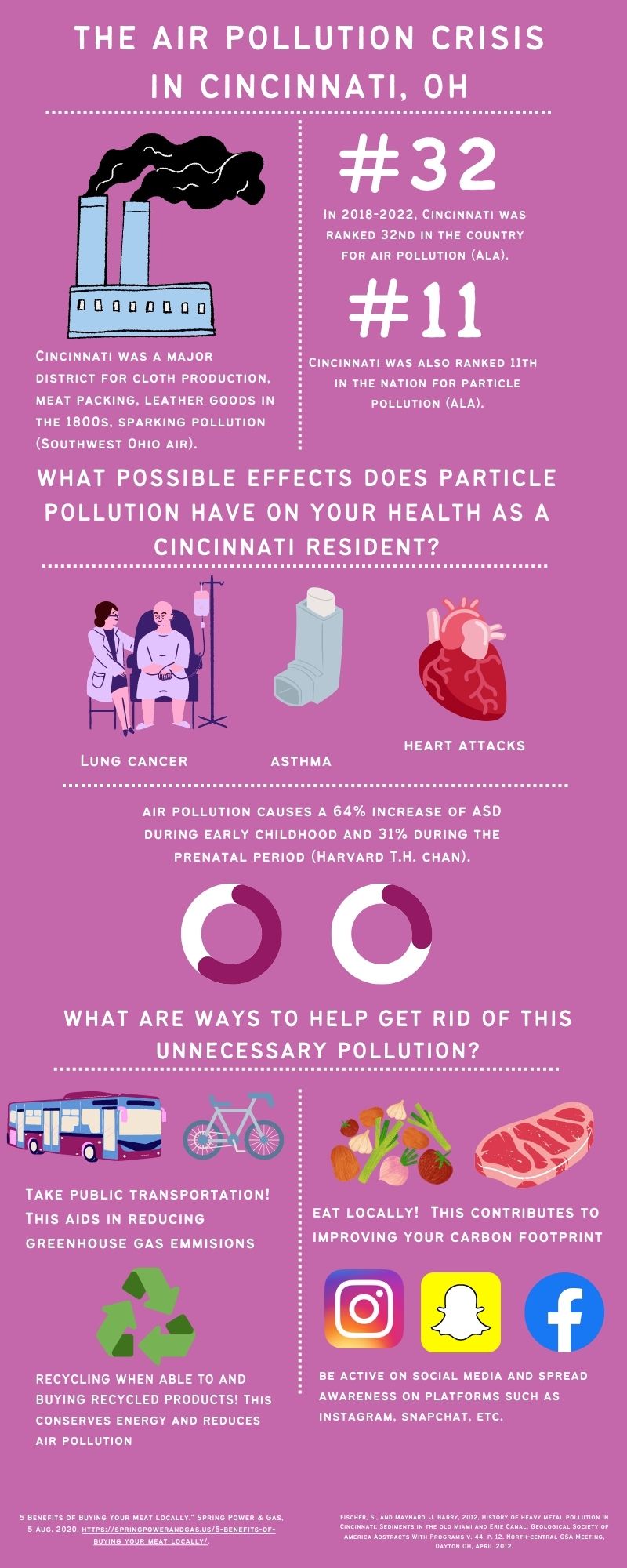
Infographic
A Note From the Instructor—Camellia Azzi
Throughout her research into air pollution in Cincinnati, Amanda demonstrated strong commitment to the issue and thoughtful consideration of the health and environmental implications of air pollution on her local community, which is clearly reflected in her multimodal project. Rather than relying on a ready-made template, she designed her infographic from scratch and incorporated select information from her research paper and images that, as she explains in her reflection letter, are made for rhetorical effect on her audience. Her persuasive use and organization of visual and alphabetic elements build a remediated argument that is very focused to her target audience and relies on strong rhetorical decision-making.
Writer’s Reflection
For my infographic, I decided to use Cincinnati residents as my audience. I wanted to use my infographic to show how big of an issue air pollution is in Cincinnati and what to do about it. The solutions that I implemented were to spread awareness in different ways and do little things like take public transportation, eat locally, etc. to attempt to make the issue better. When looking at examples of other people’s projects and infographics in class, hearing people’s inputs on them, and really looking at them for myself, it was helpful in knowing what sorts of things don’t work in an infographic and ways that I can create my own in a better way. For my infographic, I chose to use Canva in creating a well- thought out- plan and solution. Canva is really customizable so it’s helpful in creating what you want. I planned first to try and get as many statistics from my RBPA as I could so that I could do my best to use the least amount of text possible. It was difficult oftentimes to try and use less text and try and make a convincing argument without writing a lot of words.
I wanted to focus on pathos and ethos for my infographic. This is because a lot of the effects air pollution has on a town or an individual are personal and can be dangerous to your health and livelihood. I think that for my final draft, I could have done a better job in establishing my ethos because currently, I feel like it’s a little unclear. For appeals to pathos, I really just used the statistics I found to try to establish it as well as the health effects through images, so I am hoping that it stands out the way it needs to. Using an infographic allows me to do something I wasn’t able to in my paper, which was create something short and sweet that got right to the point, as well as using images and color to create something that people want to look at. As far as citing my sources, I made sure to take the sources I used in my infographic and take them from my bibliography so that I could cite them correctly at the bottom of the page. I used all of my images from Canva, so I did not need to cite those because they were not from the internet.
I struggled with having space for everything that I needed to include, because I forgot to add my sources until I was finished, which sort of messed up the rest of my infographic. I also sort of wish we had the option to do a video, because I feel like I might have been able to make a more convincing argument if I had been able to do that. If I were to create a video, I think I could have done a better job of showcasing my use of ethos as well as pathos. More people who were from the area would probably see more of an issue, because they can just watch a video as opposed to reading or looking at a piece of paper. Typically, watching something like a video is more beneficial to me.
My takeaways from this project are that you can argue or present solutions to an issue you believe in, in many different ways. This was an interesting way to present our eight-page papers and a good final project to have. It’s definitely easier and more fun for me to do something like this for a project rather than just write a paper, so I am glad that I got to do that here. Given more time or resources, I probably wouldn’t do much differently. I would establish my ethos better, as well as make things a little more organized and less cluttered to ensure that I don’t get confused. I think that my project could have an impact possibly if handed out to the correct audience and people who care about an issue like this. I could try to print them and hang them up, but I feel like people would probably just not look at it because I’d probably do the same thing if I didn’t know what something was about. I understand the concept of multimodal composing way better than I did previously. I was really confused about what we were going to do at the beginning of the project, but as the project progressed, it started to make a lot more sense.

