
Infographic
A Note From the Instructor
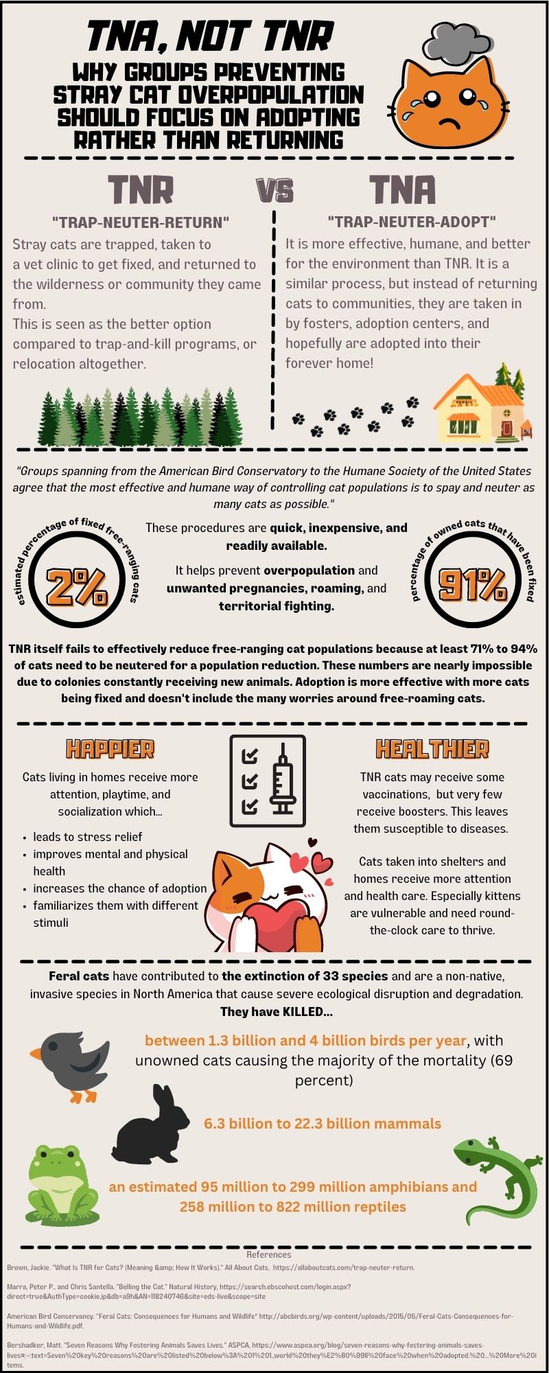
Jenna did a wonderful job creating an infographic for such a specific issue that was meaningful and relevant to her interests. Not only did she effectively provide background information on cat overpopulation for an audience who might not be familiar, but she also made sure to showcase why everyone should be invested in her issue by bringing attention to the disastrous effects feral cats can have on the ecosystem. She did an amazing job separating out her information using visual rhetoric and smart organization, creating an effective color scheme and composition to support her argument. Her final project was clear, cohesive, and thorough while still being eye-catching and readable. Jenna’s infographic is a great example of how students can find unexpected topics they’re passionate about and still create an effective, informative, and argumentative infographic, even if the topic seems too specific at first glance.
Writer’s Reflection
My audience for this project was mainly Trap-Neuter-Return (TNR) and Trap-Neuter-Adopt (TNA) groups, but also included people who may adopt or foster cats. My argument was to focus on TNA, rather than TNR or any other methods, to solve the overpopulation of stray cats in communities. Adoption is the most effective way of preventing overpopulation, is better for the environment, and allows cats to be happier and healthier. I used Google to look up examples of infographics but primarily based my infographic on the templates on Canva. Those were fairly simple though, so I took the general outline and switched it around to make it my own with more details. I used Canva to create my infographic, and it was a challenging process since I had never used it before. It took some time for me to learn how to manipulate different fonts and texts, along with shapes like the circles and dotted lines I used. I learned how to move big chunks of things at once, so I didn’t have to do everything individually. The layout of the website is simple, so I could find things relatively easily. I’m not the most efficient, but I’m way more comfortable with it now.
I tried to run into the project with empty hands like I usually do and of course, it didn’t work. About a third of the way through I sat back and drew an outline of how I wanted my infographic to look. I took what was my “thesis statement” and arranged the different sections in that order. I took inspiration from an example shown in class, where one side of the argument was on the left half of the infographic and the other side was on the right side, like a mirrored effect. I thought this would be a good way of showing the pros and cons of TNR versus TNA. I began by defining the difference between the two, because even though I was involved in a TNR group, I didn’t know TNA existed and what the difference was. Since my audience was mainly people and groups already helping out stray cats, I tried to create exigence for the audience by showing the difficulties feral cats face and how they are negatively affecting the environment. The TNR programs in place have proven to be ineffective in my argument, especially compared to TNA. This will give those already trying to make a difference a new point of view on the problems and how they should be better addressed, along with motivation to speak up and make a change.
My argument used logos, pathos, and ethos together. Ethos was established through where I got the information. I used specific, trusted organizations that have done extensive research on stray cats and their effect on the environment. I cited these resources at the bottom using MLA format, excluding the date they were published since the infographic has space restrictions. I made sure to include the author, website title, and a link to give proper credit. Logos was used through specific facts and statistics, like how many animals are killed by cats and how many are vaccinated.
Pathos was used mainly through my visuals. I started off showing a big, crying cat to play into emotions, and at the end used a happy cat with a heart, showing how adoption makes cats happy and to make my audience feel happier. When defining TNR and TNA, I used trees to represent wilderness as a way of making my readers feel empathy for cats who are left to fend for themselves. This was put against paw prints leading into a home, where readers can see that adoption gives cats a proper place to thrive in. I also bolded words that I felt were important and strong towards the overall message, for example, “unwanted pregnancies,” “territorial fighting,” and “they have KILLED….” This draws readers’ attention to these specific words, emphasizing their importance.
I used a small number of colors since it is a serious topic, using blacks, whites, grays, greens, and oranges. I chose orange because the original element I used was an orange cat, so I based the rest of the infographic around that. I Googled what color compliments orange and found that green worked well. It worked out great, because the other elements I used were trees, frogs, and lizards, so green ended up being used anyway. I used these colors to make the subtitles, important words, and elements pop against the gray and black text.
The biggest affordance of using an infographic was my ability to use pictures/elements to represent my key points and draw the attention of my audience, especially with rhetorical appeals. My biggest challenge was the lack of space. I tend to over explain things and want to put in as much information as possible, which can’t always be done. I need to work on making things simpler and more concise. Writing an infographic instead of an essay felt very weird to me. I was less formal with my wording. It felt as if I was making a news article where they use clickbait to grab the audience’s attention (though all of the information was true).
For the final draft, I made some changes to make my infographic more visually appealing. I changed the block letters at the top and made them black so they could be read more easily. I got rid of the “this stands for…” in my definition section and instead bolded “trap-neuter-” and explained them underneath, which was also slightly reorganized. I made the “91%” smaller, even though it hurt a little because now the fonts aren’t the same size, but it made it look more even. For my “happier and healthier” section, I used bullet points, shortened sentences, and broke it up to make it less wordy and easier to follow. I also changed the font I used for all of my explanations to one that was less spread out. This created more white space and made my infographic less cramped, while still allowing the same amount of information. I followed my instructor’s advice and added a light background to the infographic, and for my own style, I added a black border, which I feel helped tie it all together.